Our logo explained: how we built our new brand identity
Our journey began in 2018 when we were just getting to connect with our market with essential and basic communication. As the audience responded to our message, we realized it was time for a bigger change. We needed to take a step out of our comfort zone.
Like everything we do, we started this transformation with a reason to exist, our purpose. Once we cleared our mindset and redefined what we wanted Innerforce to communicate, we reached out to a creative agency to help us manifest what we wanted to say.
Our journey
The creative process started with a Brand Sprint, basically a workshop where we worked together with the agency on different ways to settle our “abstract brand” into something more real.
We redefined our values, and what we wanted Innerforce to represent, we analyzed the path we wanted to take a short-, medium- and long-term. We also answered some questions such as: What? How? Why? So finally we were able to choose the communication tone and understand what we wanted on a visual and esthetic level.
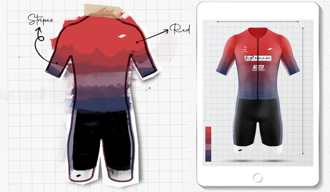
Once we finished the workshop, we started working on the mood board with ideas and references using Pinterest, Behance, and everything the internet could give us. We gathered it all together in Miro and once we arrived there, a lot of different paths emerged.

A lightning bolt that keeps you on track
Innerforce embodies the idea of being 1% better every day. It's not about being better than anyone else but surpassing yourself. It’s about finding that innerforce that helps each one of us get through obstacles.
Our logo is the thunderbolt. It conveys movement, power, and energy. It’s the goosebumps you get during the swim start. It’s the rush of energy and fulfillment that radiates from within your body when you toe the finish line.
With a slight tilt towards the right, we reinforce the idea of velocity and movement. We are expressive and modern without losing athletic elegance with an accent and background colors. Black and white build the perfect palette to drive consistency across all our communication while being flexible and dynamic.
Team Innerforce
We dedicated a couple of days on doing research and analyzing how other brands work when it comes to teams. We needed something strong and easy to recognize. We went with a circle, with the lightning inside to achieve the idea of teamwork, collaboration, assistance, training, and everything a team makes you feel.

Written by
![]()
Our logo explained: how we built our new brand identity
Our journey began in 2018 when we were just getting to connect with our market with essential and basic communication. As the audience responded to our message, we realized it was time for a bigger change. We needed to take a step out of our comfort zone.
Like everything we do, we started this transformation with a reason to exist, our purpose. Once we cleared our mindset and redefined what we wanted Innerforce to communicate, we reached out to a creative agency to help us manifest what we wanted to say.
Our journey
The creative process started with a Brand Sprint, basically a workshop where we worked together with the agency on different ways to settle our “abstract brand” into something more real.
We redefined our values, and what we wanted Innerforce to represent, we analyzed the path we wanted to take a short-, medium- and long-term. We also answered some questions such as: What? How? Why? So finally we were able to choose the communication tone and understand what we wanted on a visual and esthetic level.
Once we finished the workshop, we started working on the mood board with ideas and references using Pinterest, Behance, and everything the internet could give us. We gathered it all together in Miro and once we arrived there, a lot of different paths emerged.
A lightning bolt that keeps you on track
Innerforce embodies the idea of being 1% better every day. It's not about being better than anyone else but surpassing yourself. It’s about finding that innerforce that helps each one of us get through obstacles.
Our logo is the thunderbolt. It conveys movement, power, and energy. It’s the goosebumps you get during the swim start. It’s the rush of energy and fulfillment that radiates from within your body when you toe the finish line.
With a slight tilt towards the right, we reinforce the idea of velocity and movement. We are expressive and modern without losing athletic elegance with an accent and background colors. Black and white build the perfect palette to drive consistency across all our communication while being flexible and dynamic.
Team Innerforce
We dedicated a couple of days on doing research and analyzing how other brands work when it comes to teams. We needed something strong and easy to recognize. We went with a circle, with the lightning inside to achieve the idea of teamwork, collaboration, assistance, training, and everything a team makes you feel.
Written by
![]()
SEE WHAT CUSTOM APPAREL LOOKS LIKE
GEAR UP
MORE FROM THE BLOG
The Difference between Tri Shorts and Cycling Shorts
When athletes train for either a triathlon or biking event, there seems to be some confusion about whether to get...
One-Piece vs Two-Piece: The Difference Between the Tri-Suits
Triathlon suits are unique compared to most other outfits for endurance sports, owing to the fact that it needs to...
What is a Brick Workout? Triathlon Training Technique Explained
If you are part of the triathlon scene, then you are likely to be acquainted with the brick workout. But...
Essential Steps When Training for Your First Triathlon
People used to view triathlon as a form of self-torture for endurance junkies. Thankfully we have moved on from those...